Lincoln Center: 8 Festival Websites
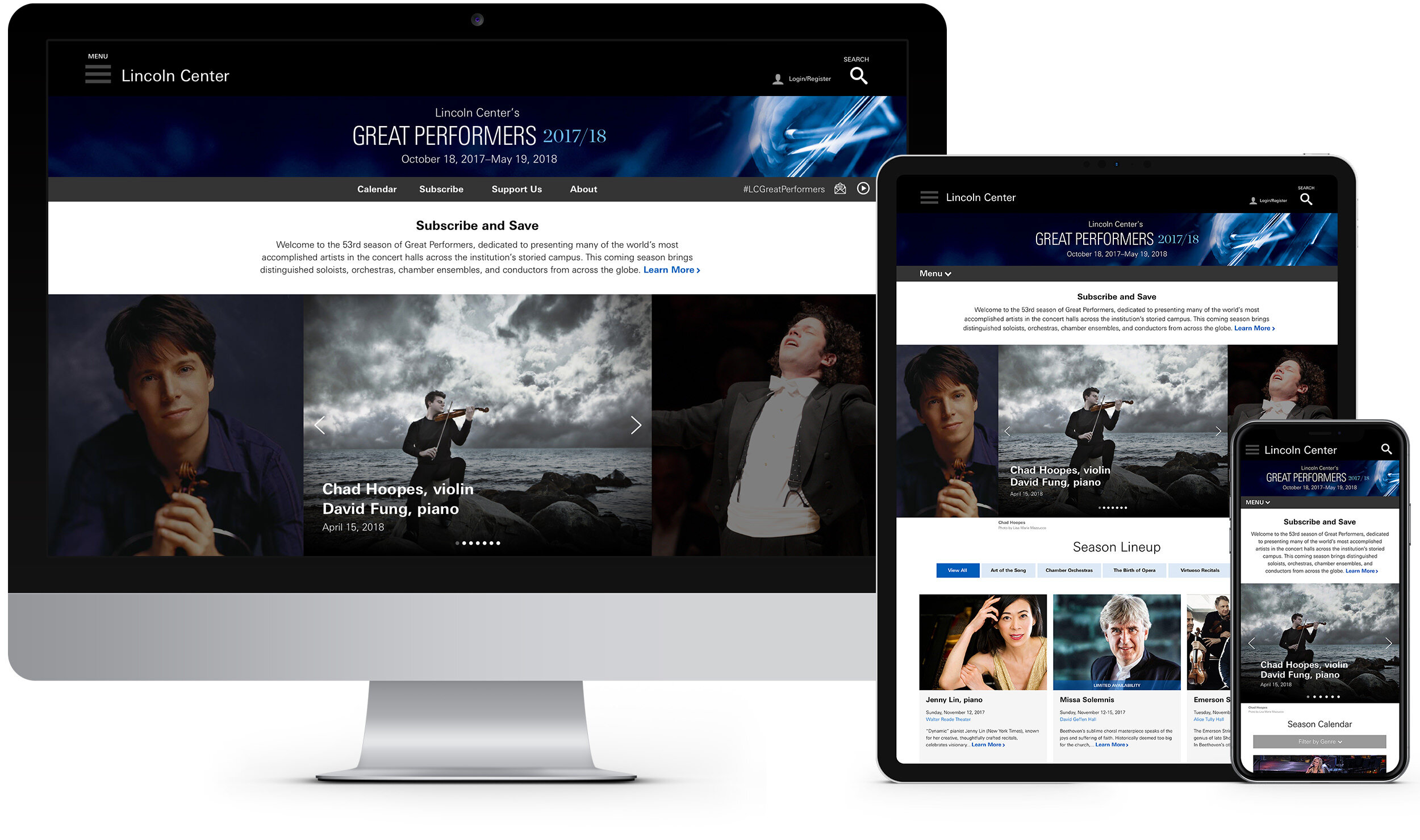
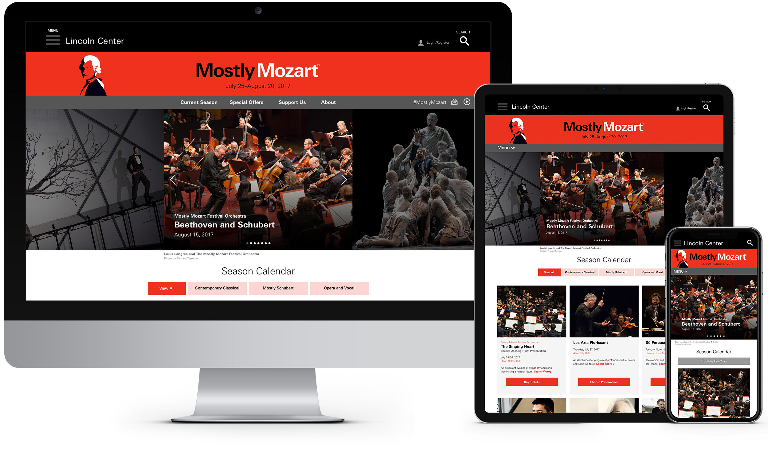
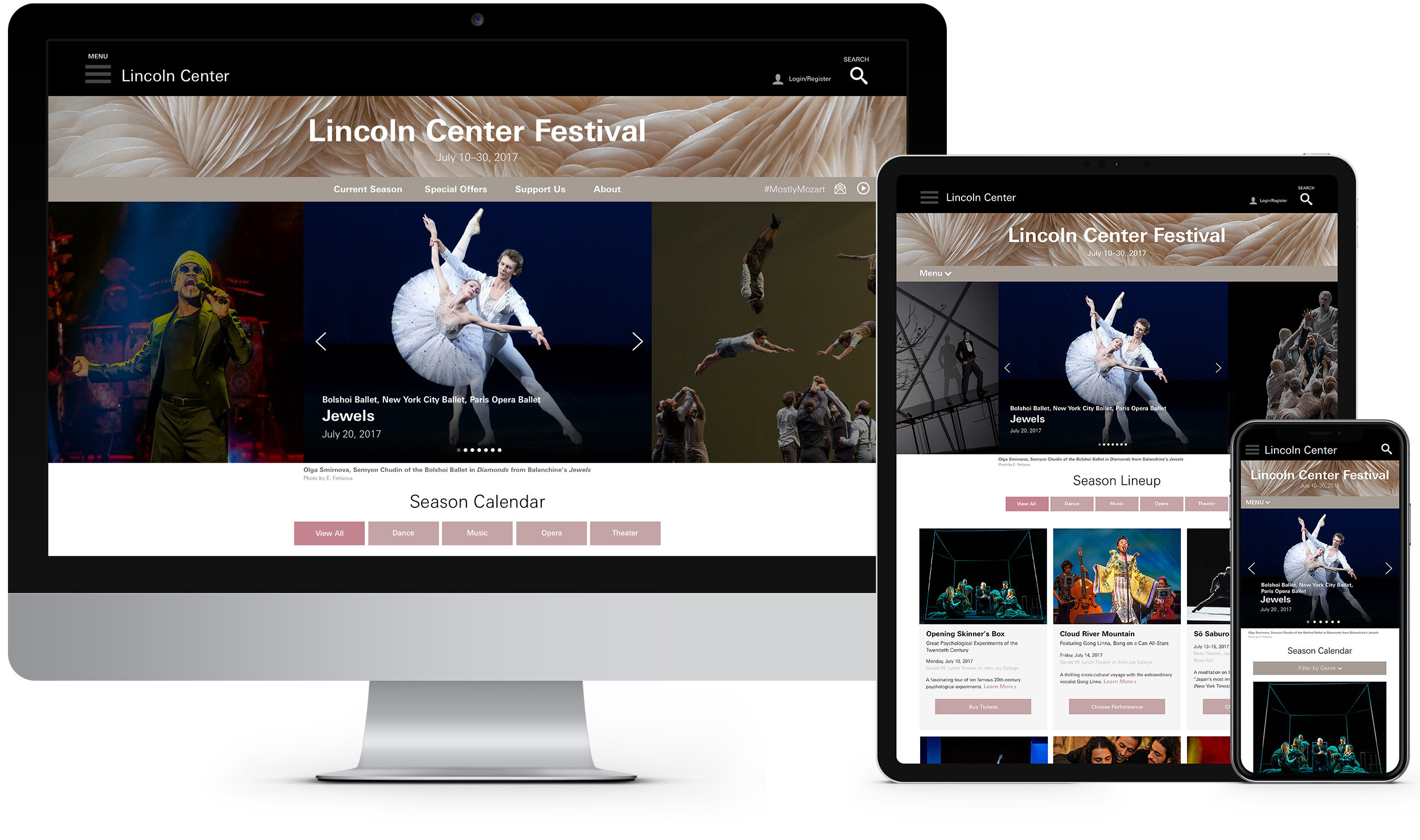
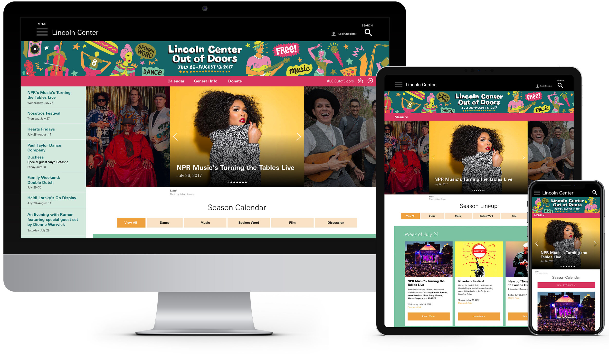
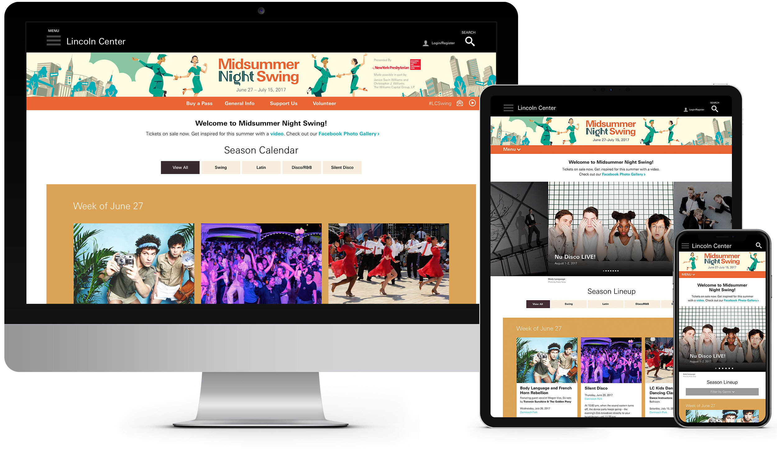
This was an entire digital transformation of all eight programmatic responsive websites at Lincoln Center for the Performing Arts. Prior to this initiative each of the websites were independently built by an outside agency which resulted in inconsistent functionality, increased dev time and no style guides. The newly designed websites are now based on a unified and structured template system.
Websites: Great Performers, Mostly Mozart, Midsummer Night Swing, American Songbook, Live From Lincoln Center, Out of Doors, White Light Festival and Big Umbrella Festival.
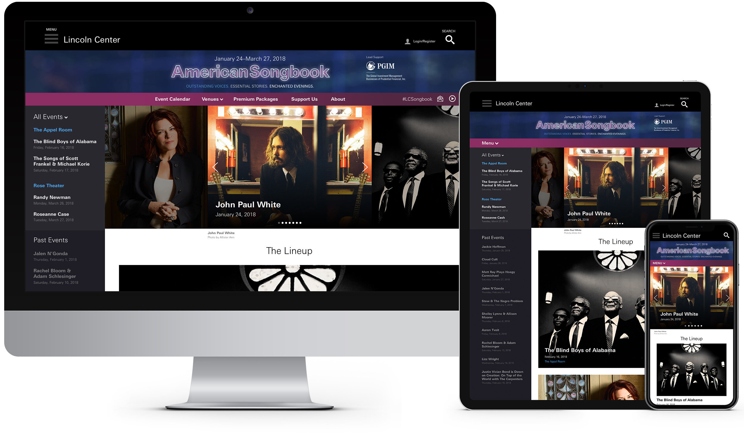
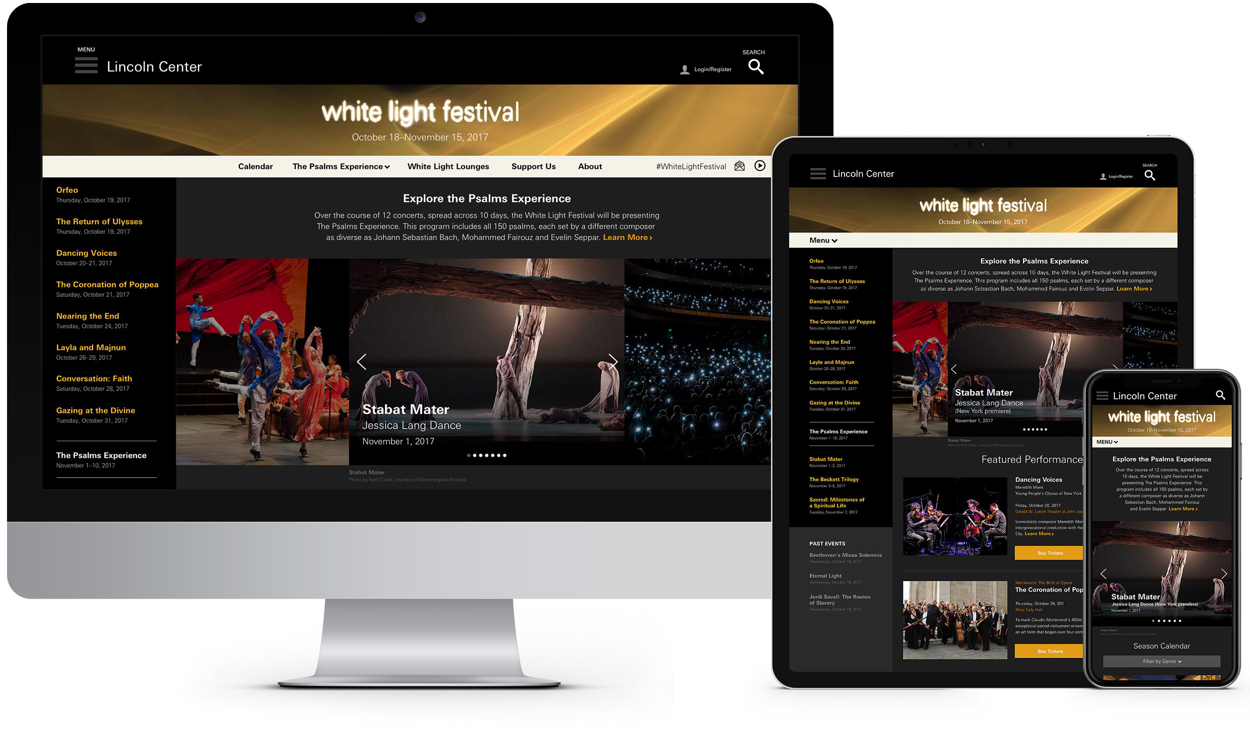
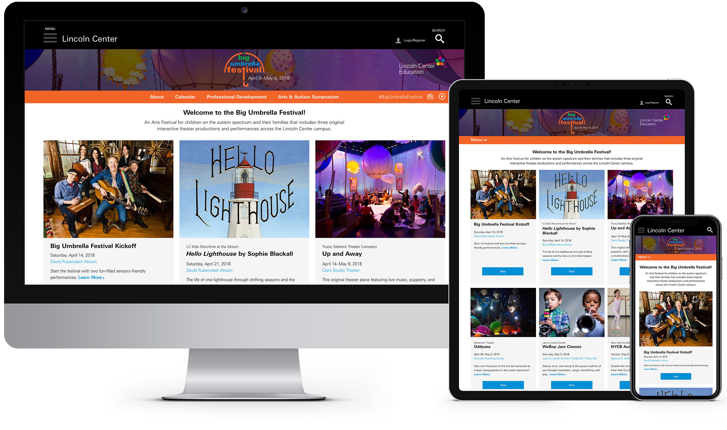
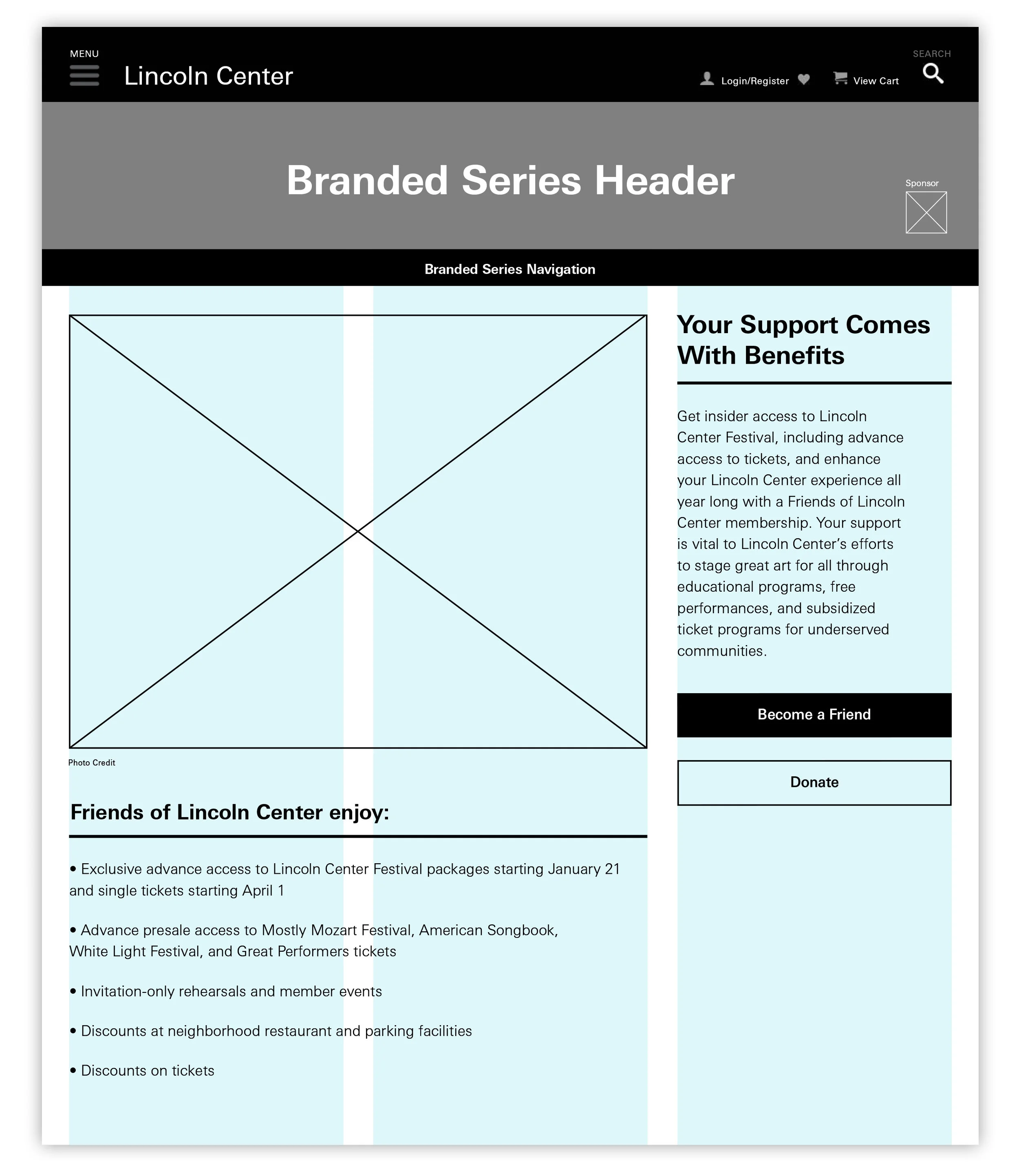
This system had to be flexible enough for the needs of eight very different festivals and programs with changing and growing content year to year. The newly designed sites now use two consistent style guides: one with a left rail and one full width to cater to the needs of each festival. All were also brought into the main platform at LincolnCenter.org. The end benefits of the new sites result in faster build time, modular thinking, and one CMS allowing for more flexibility and usability.
My Role
Art Direction, UX/UI Design, Digital Strategy, Rapid Interactive Prototyping, Social Media Design, aligned stakeholders on website goals, Information Architecture, presented designs to leadership teams at key milestones, QA, and created digital design guidelines.
Client
Lincoln Center for the Performing Arts
Mobile-first user experience
While streamlining all eight sites into the new templated system it was very important to have each festival be able to maintain it’s own brand. Now, there’s an area provided at the very top of each website allowing for custom photography or illustration for each season. The colors of the sub-navigation, call-to-action buttons and inline links are picked to compliment the chosen artwork. These are various homepages and show pages featuring customizable modules that can be turned on or off such as marketing messages, video/photo carousels, and genre filters.
SHOW PAGES
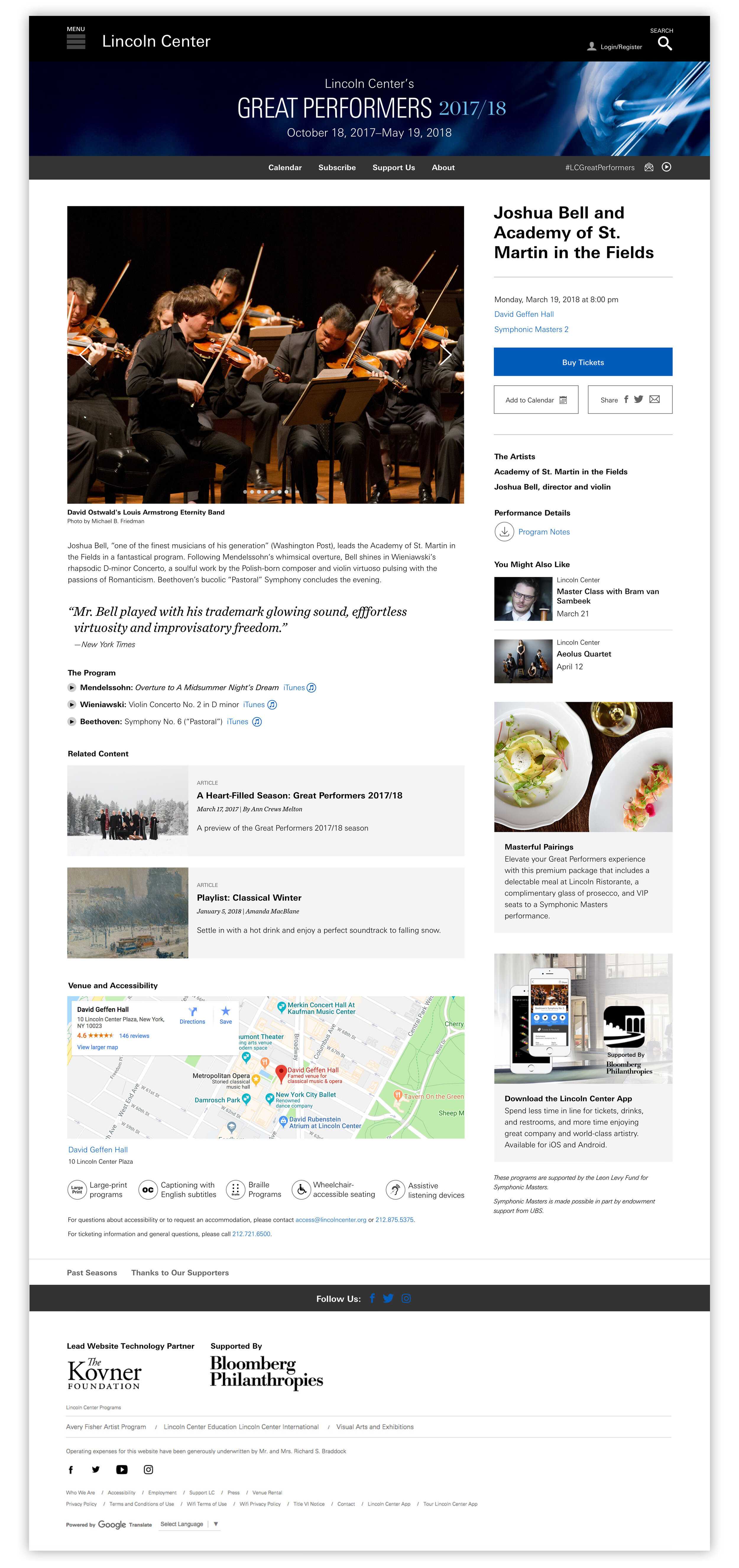
Below are examples of what a Show Page looks like with many of the modules turned on, including a right rail filled with links to download program notes, blocks for suggested shows, and an Lincoln Center App ad to name a few.
CALENDAR PAGE
Featuring a filter system in the left rail below a mini-monthly calendar.
SUMMER SHOWS
Weather can sometimes play a role in start times of shows, especially in the summer months in outdoor spaces. I designed weather widgets that show up when a thunderstorm, for example as seen below, may cause a delay or a cancelation. Users can then close it and the icon lives in the navigation where they can open it again.
Buy a Pass and Save page for Midsummer Night Swing 2018. I created illustrative collages with the season art.


