Lincoln Center: Visit Website
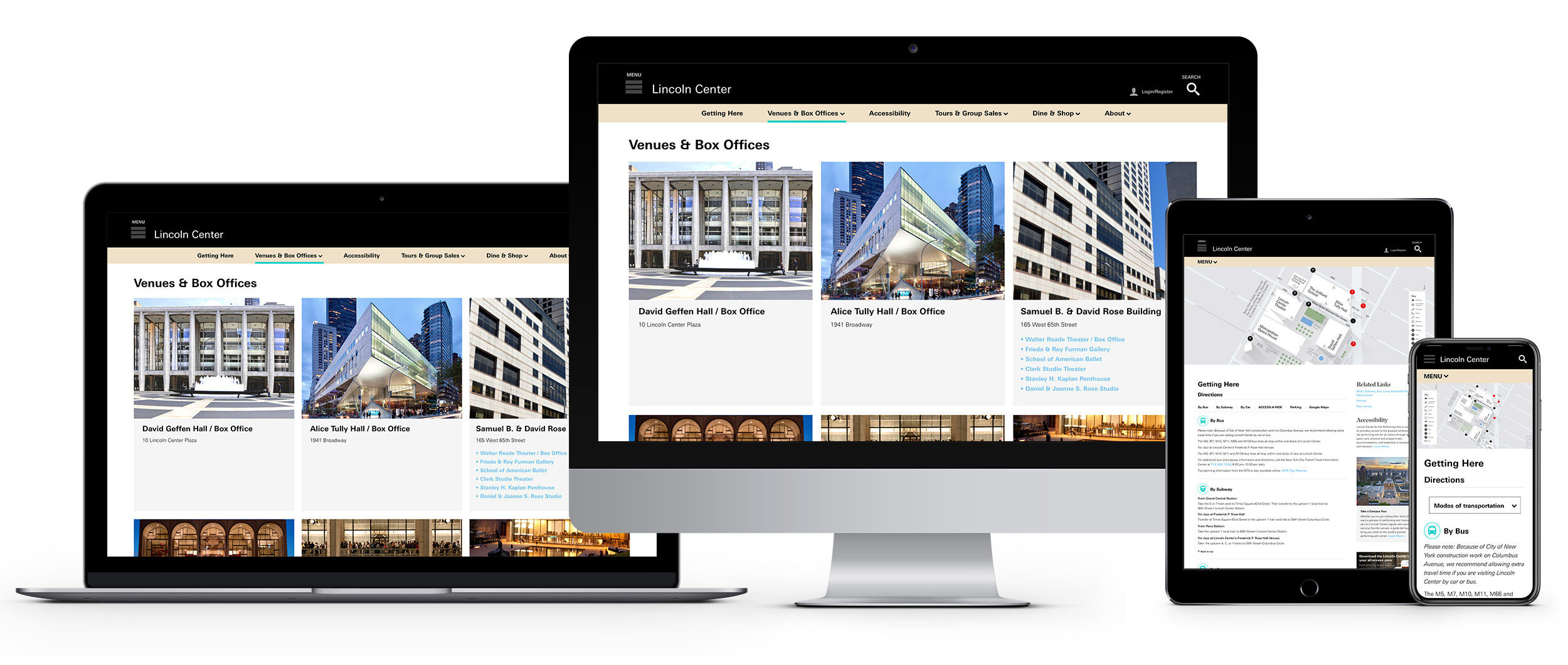
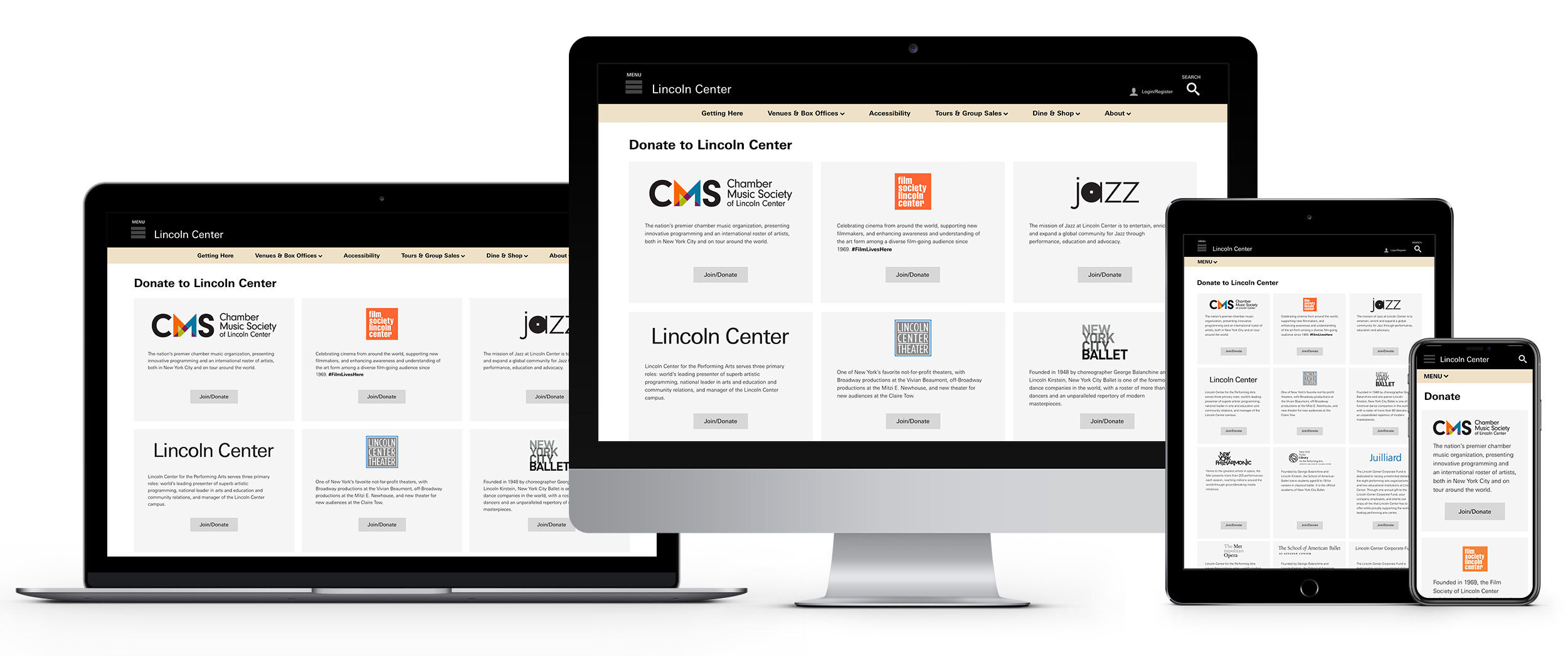
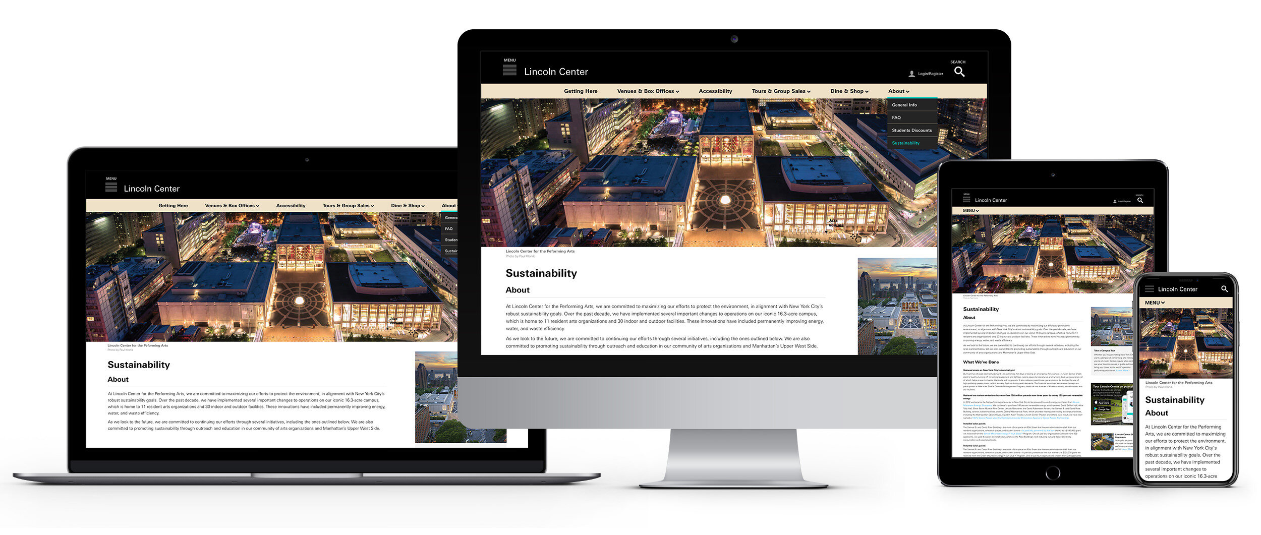
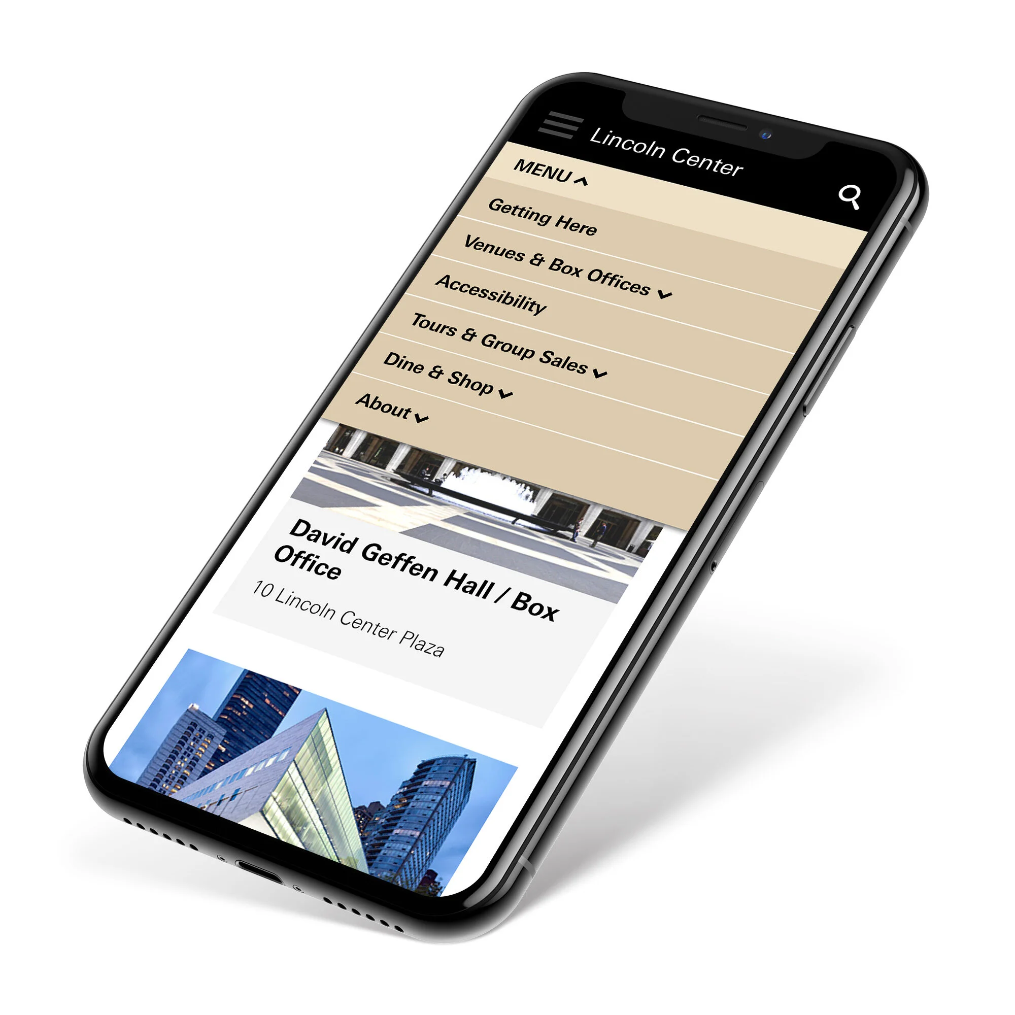
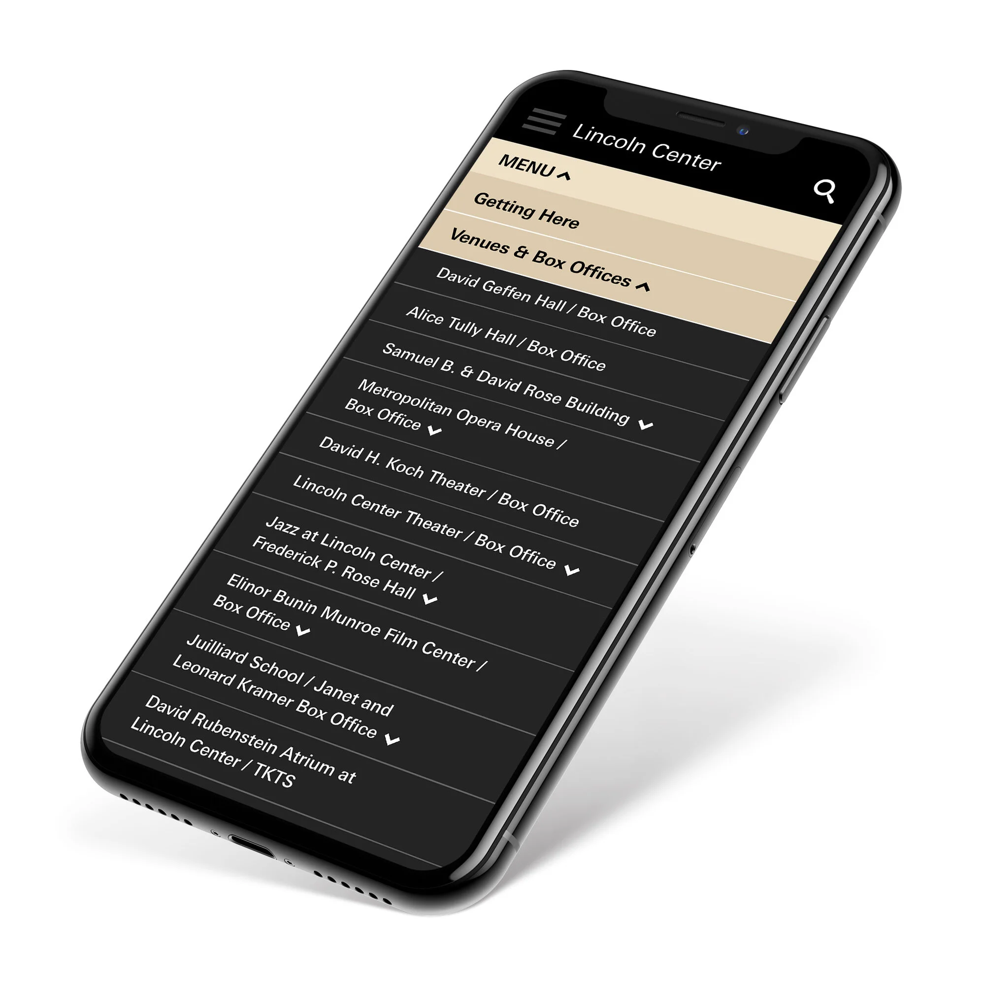
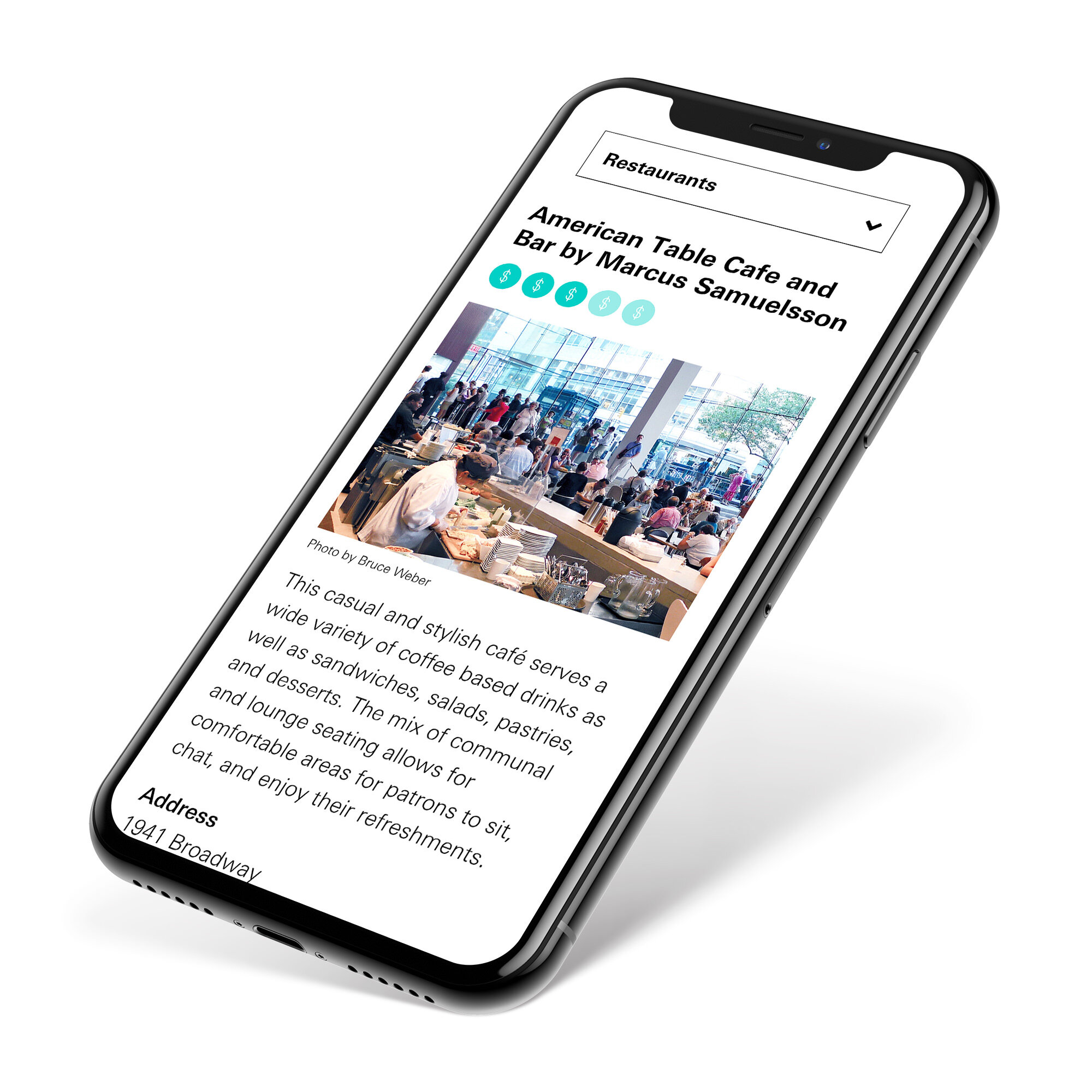
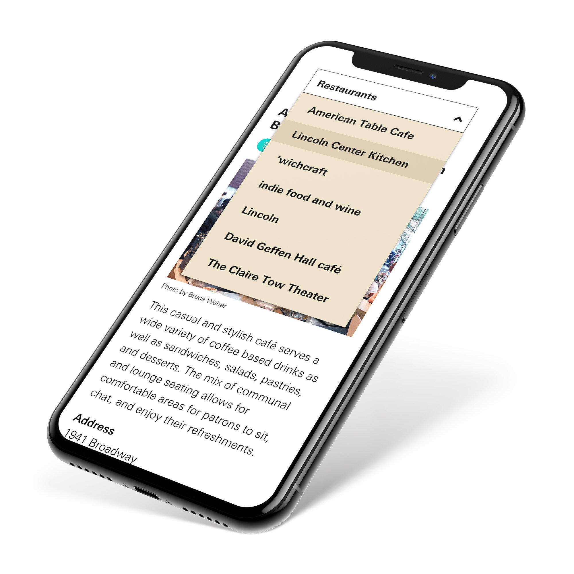
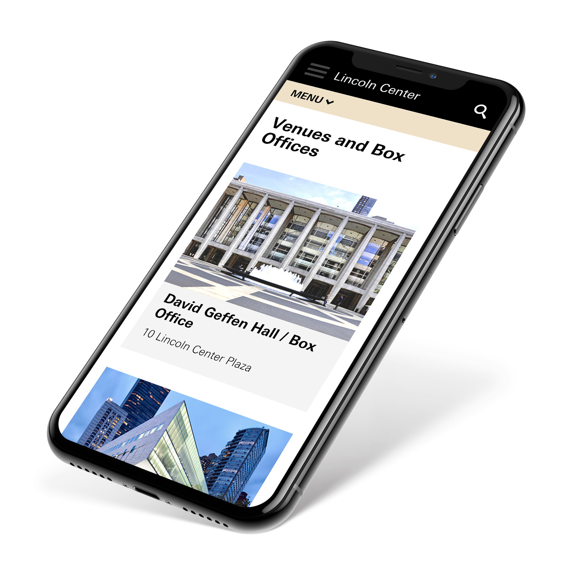
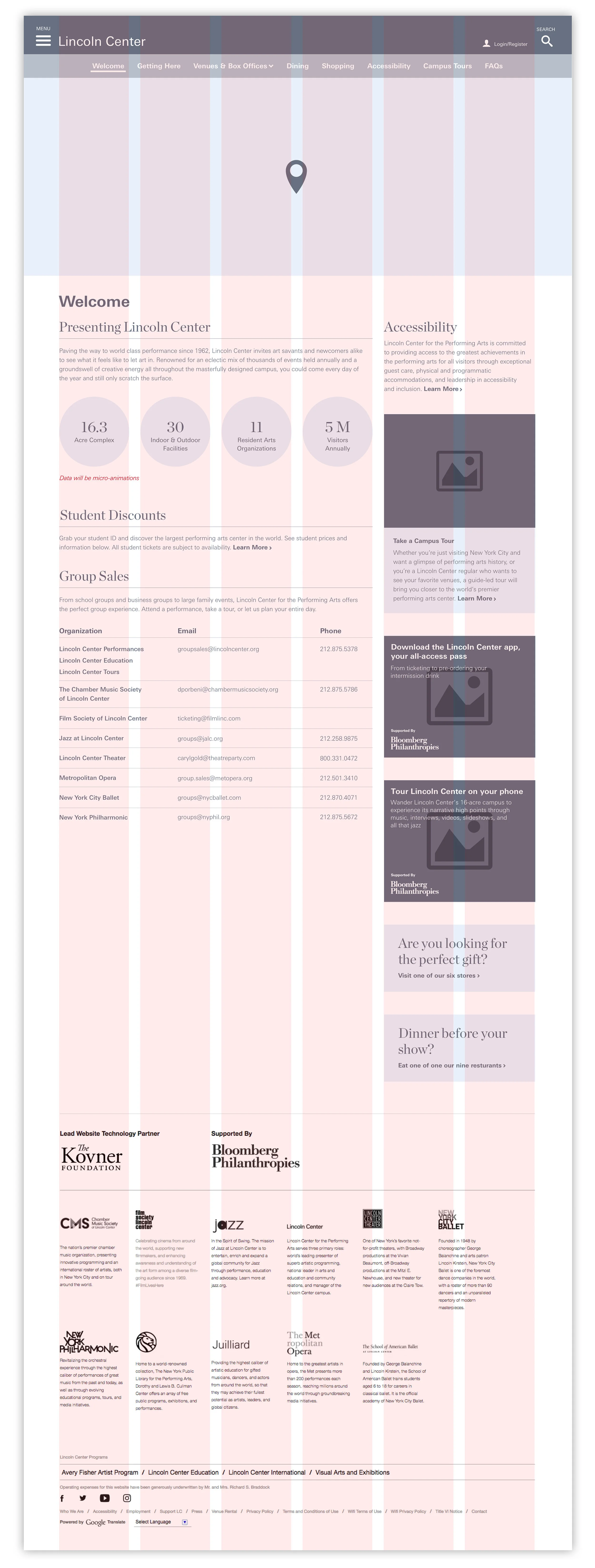
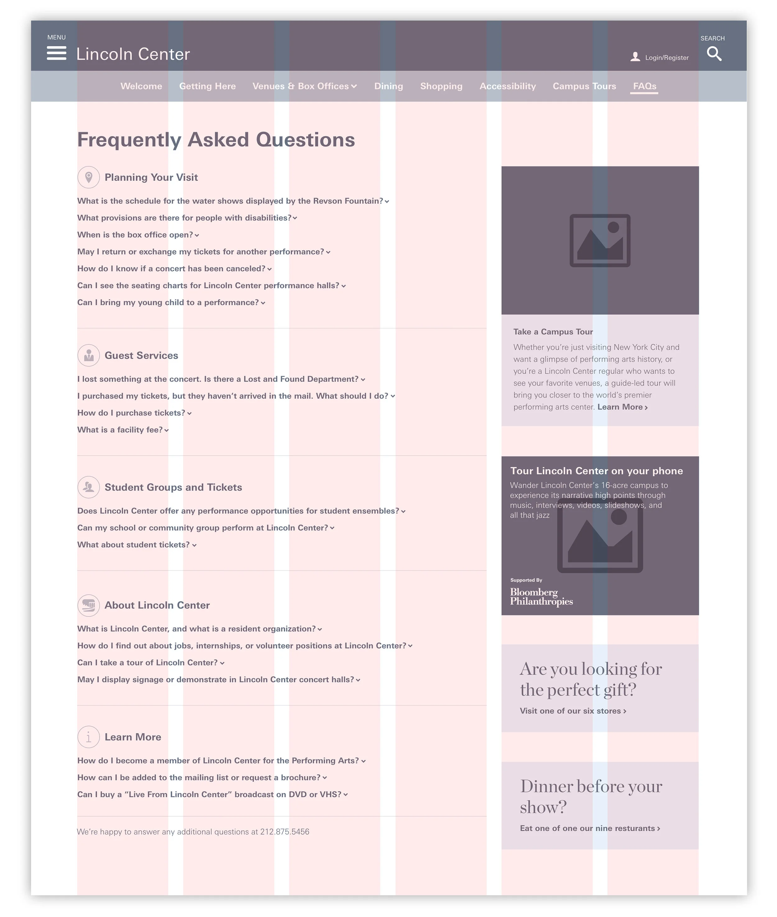
A complete redesign of LincolnCenter.org’s Visit site. This new module-based interface was designed with flexibility in mind. Prior to the re-design the content was hard for users to parse and sift through. I started with an audit of the original site to determine what could be either eliminated, paired down or combined. What I found was a lot of repetitive information throughout. I streamlined and structured the content in a more digestible format. I worked on wireframes, visual design and interactive clickable prototypes for both desktop and mobile. Since the site is text heavy it needed to be clean, modern and also have a new approach to navigation globally. These are a select grouping of pages.
My Role
Art Direction, UX/UI Design, Digital Strategy, Rapid Interactive Prototyping, aligned stakeholders on website goals, Information Architecture, presented designs to leadership teams at key milestones, and created digital design guidelines.
Client
Lincoln Center for the Performing Arts
VENUE PAGE RE-DESIGN
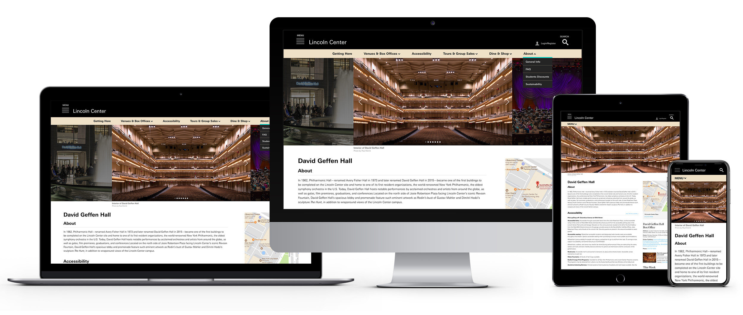
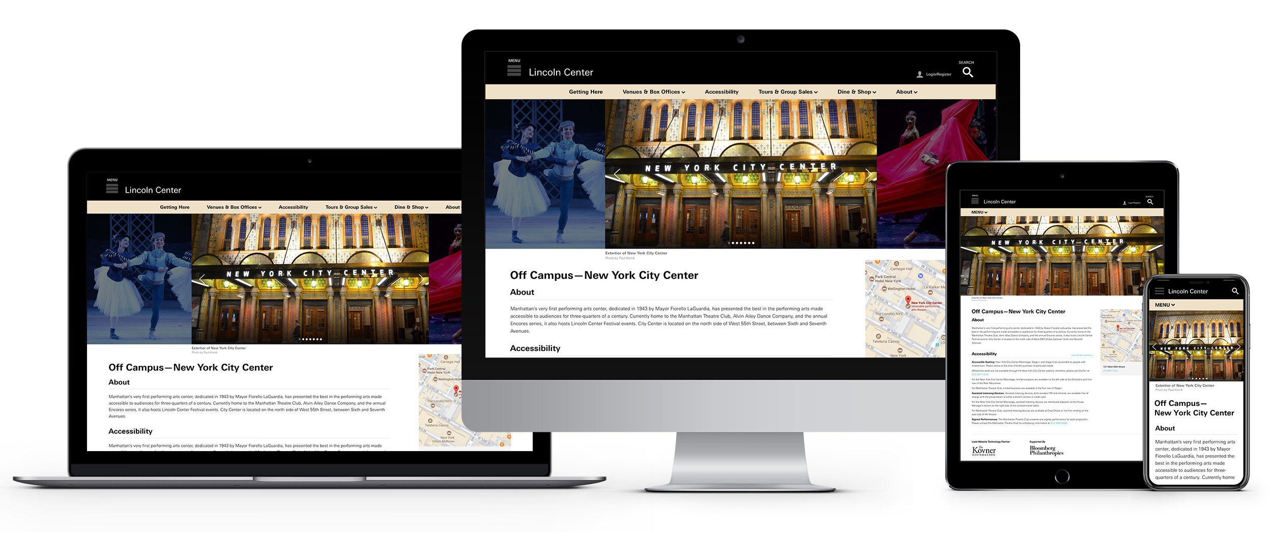
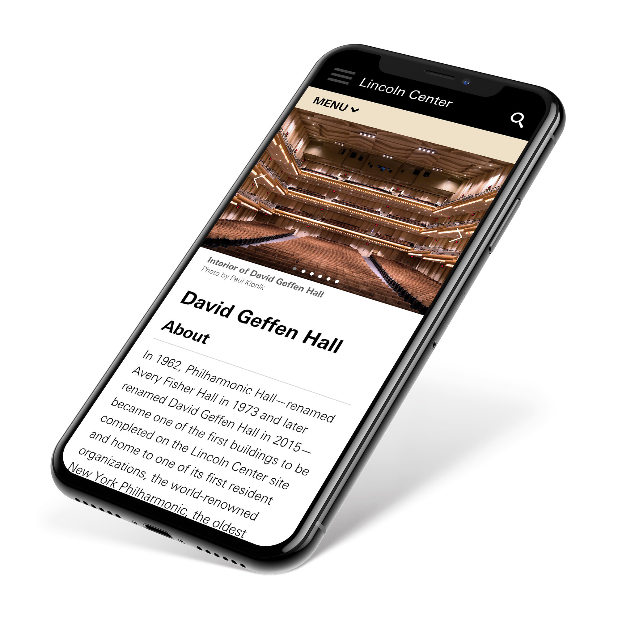
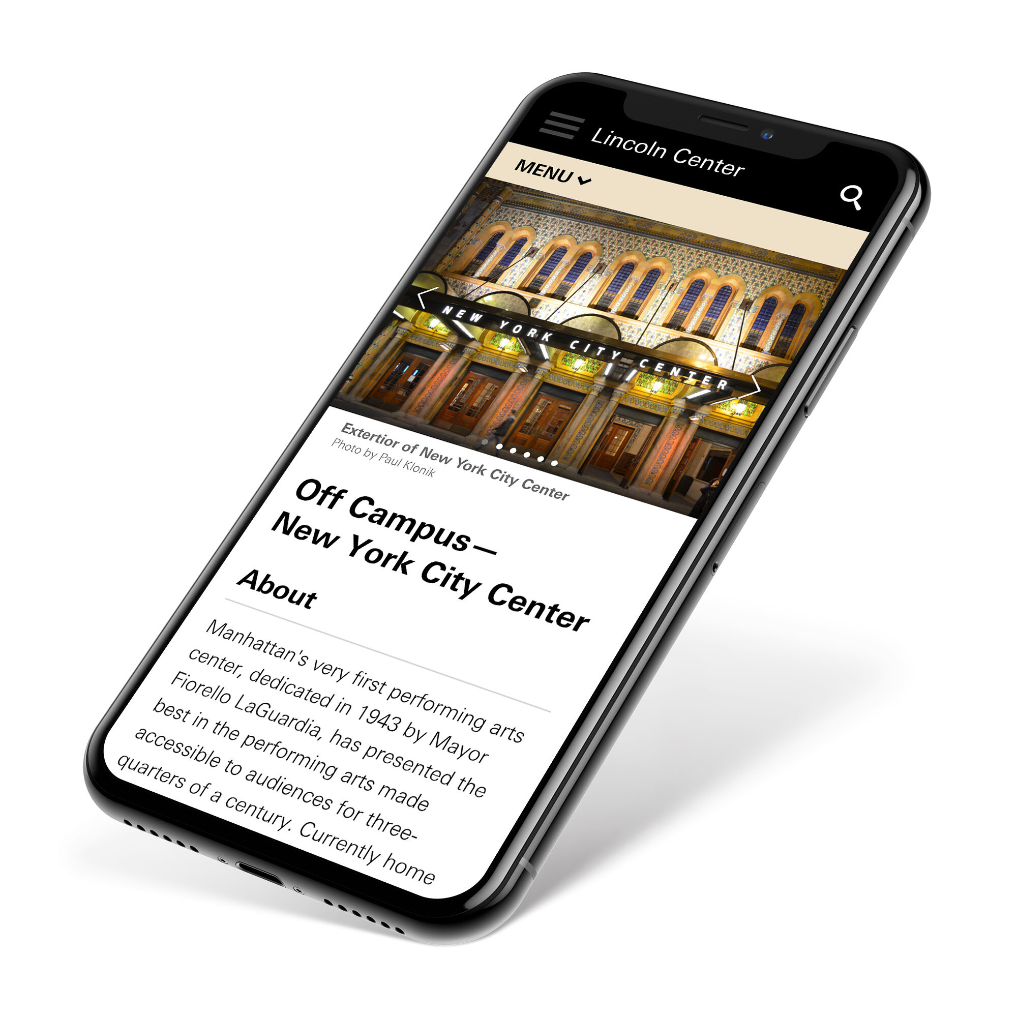
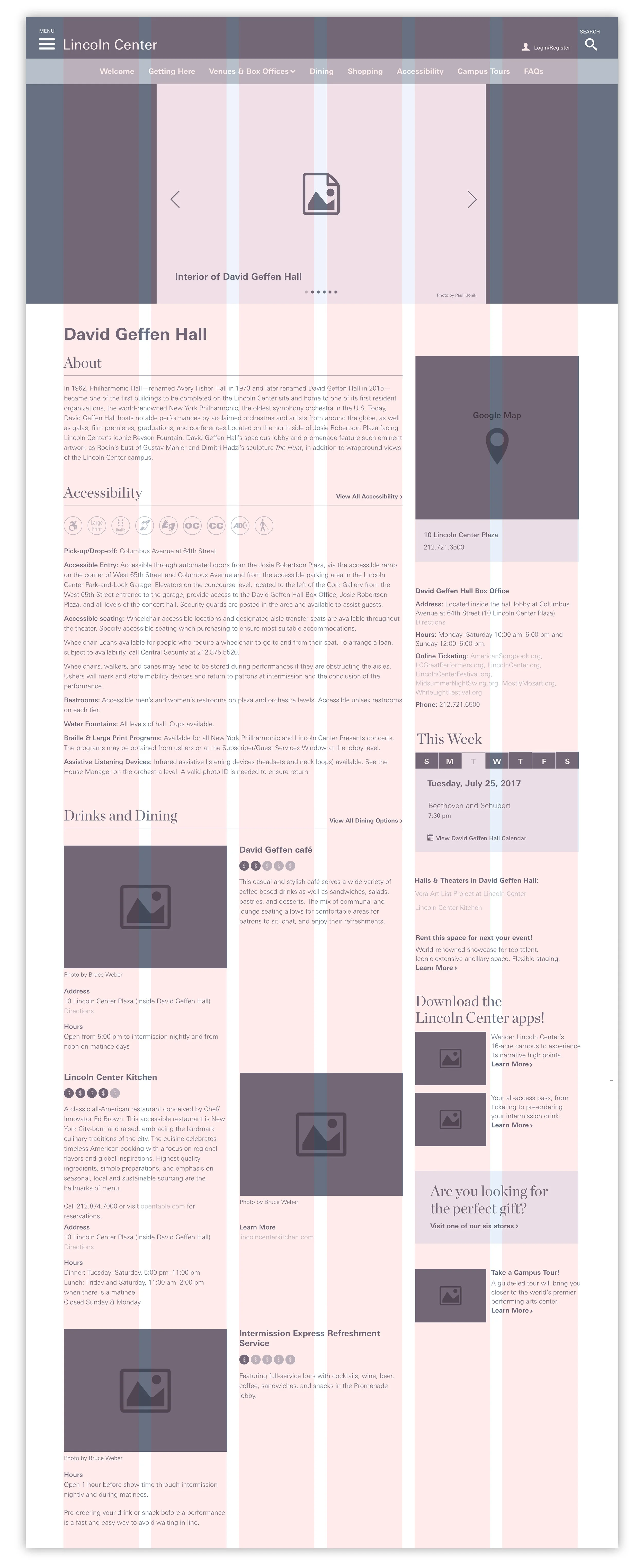
A example of a newly designed venue page which focuses on creating an immersive experience with a carousel of beautiful images. Previously each venue page had just one large photograph that overtook the entire page. Previous to this redesign each venue page was sparse and didn’t highlight all the benefits of what visiting Lincoln Center encompasses. I designed a right rail allowing for customizable relevant content modules and for scalable growth.
The “Getting Here” Page Re-Design
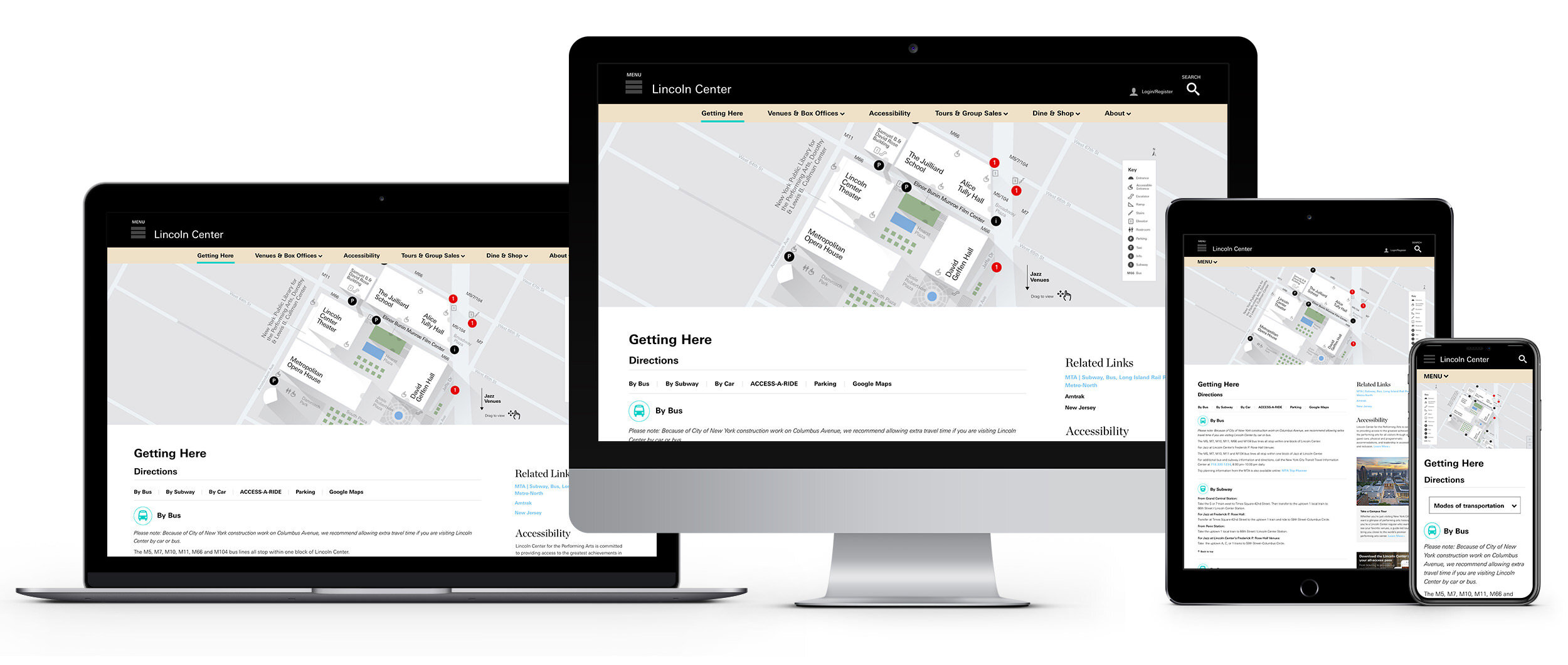
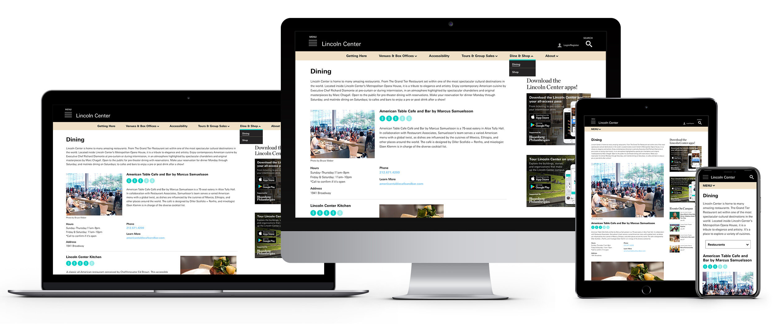
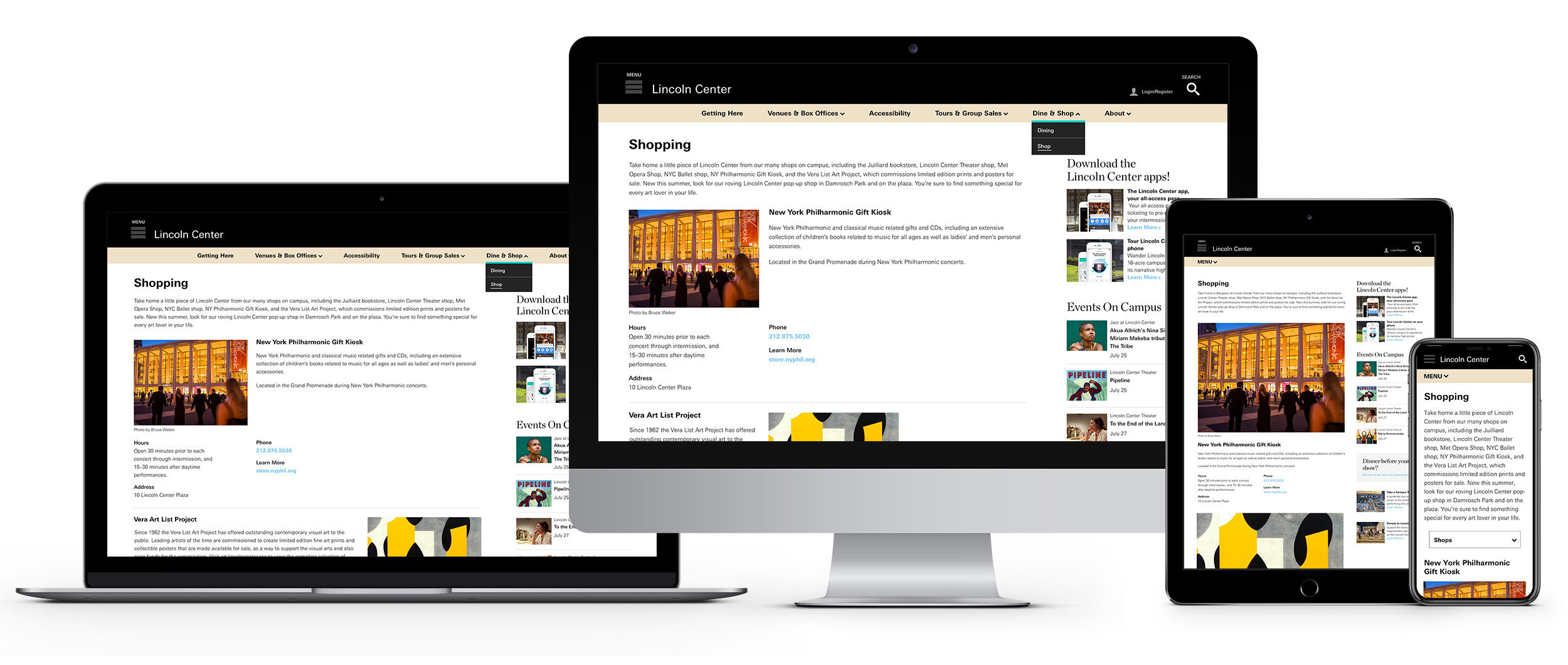
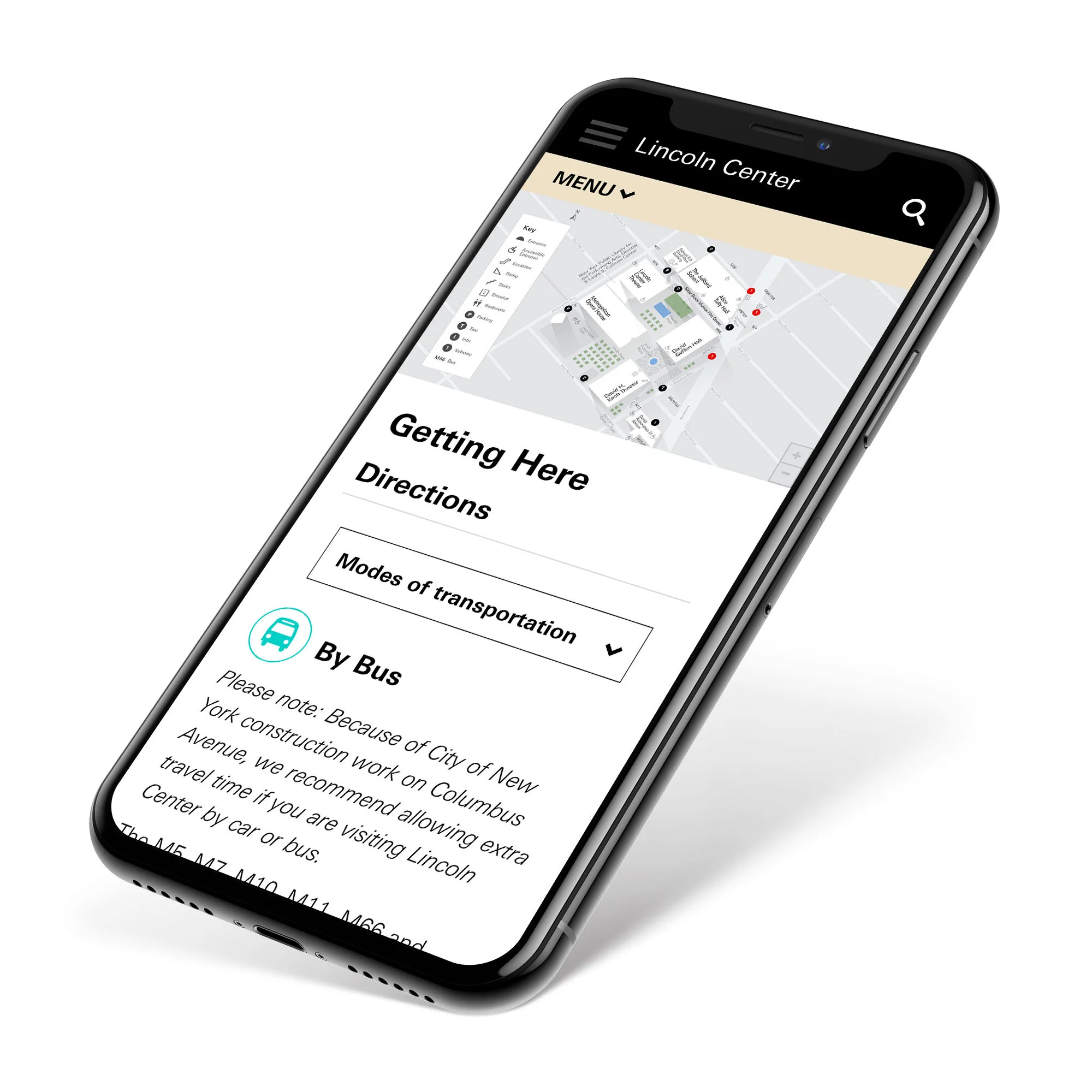
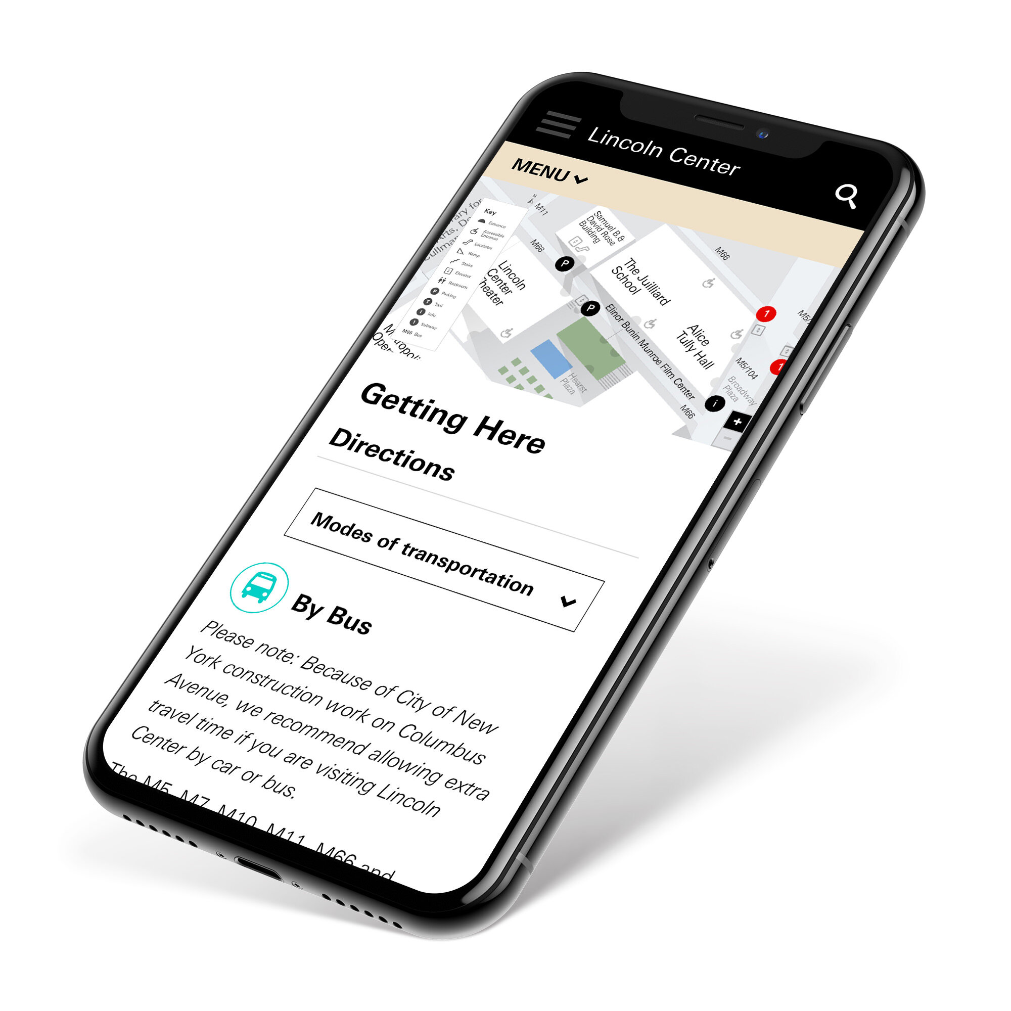
The Getting Here page features a new interactive custom map users can zoom in and out of, drag to move around and each venue is clickable offering an overlay with the address and link to it’s own page. The Directions section is now easier to navigate and separated out by modes of transportation. The customizable right rail has content modules designed that are relevant to being a visitor of Lincoln Center such as related links, app ad downloads, dining and shopping suggestions.
A New Search DESIGN
Pathing / Site Map
Detailed pathing
I conducted an audit of the original site before the re-design. This is a detailed pathing and site map for the re-design.
HIGH-FIDELITY WIREFRAMES (SELECTED PAGES)
Based on a six-column layout


